This week’s release for Time in Status Cloud introduces charts for main report screen.
Now, you will see a little cute chart button next to the issue key for each row. (For the sake of avoiding clutter, the button only appears when the mouse pointer is over the row).
The button opens a dialog that shows one of several chart types for the selected issue. The charts available change based on report type.
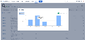
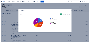
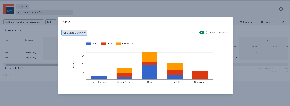
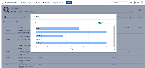
Exclude Current State option is also available here.
Details can be found in the documentation page here: TiS Cloud – Charts
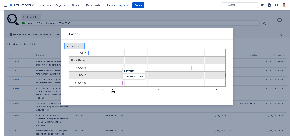
Charts are available only for List type reports for the moment. Charts for Average and Sum reports and even more are on the way…
As always, you can find Time in Status in its Atlassian Marketplace page and reach us through plugin@obss.com.tr if you have any questions.