What exactly is ‘Jira Dashboard’ and ‘Why everyone talks about it’, you may ask. Well, dashboards are life-savers. Lots of things are happening at the same time. Meetings to join, reports to create, and tasks to finish. That’s why Jira dashboards are super convenient for many product managers, scrum masters, project managers, C-levels, and so on: Jira dashboards serve as a central hub for visualizing and monitoring project data.
Jira dashboards offer a customizable interface that aggregates reports from various projects into a single, cohesive view, which is particularly useful for quickly grasping project status, progress, and key metrics. They are super-helpful because you can configure them as you want. Every organization or person’s need can be different. So, you can truly and fully customize your dashboard to make it a perfect for you, and for your team. And the best part? Nobody needs to ‘prepare’ reports every single time. Once configured, dashboard is always up-to-date and ready for anyone who wants to check the data and track progress.
What about Jira gadgets? Think of gadgets as the individual reports that come together to form your dashboard. These are small, configurable modules that display specific information and reports, often based on a saved JQL (Jira Query Language) filter. A wide variety of pre-installed gadgets are available, ranging from the Activity Stream for recent activity summaries to the Pie Chart gadget, which visually breaks down search results based on a chosen statistic.
Why Time in Status is a Must-Have?
Short answer: to optimize. You need ‘insight’, not just data. Having data without insight is like seeing the smoke but not the fire. To identify your bottlenecks, analyze team performance, improve transparency, and speed things up, you need data-backed decisions. Whatever process you run in Jira, whether technical or business, before long you’ll start asking how much time is really being spent at each stage. Time in Status gives you that. It is beyond simple time tracking or logging. The real magic is that it helps you to have a better workflow for all stakeholders.
What Types of Metrics Can You See with Time in Status reports?
So, what exactly can you measure with these reports?
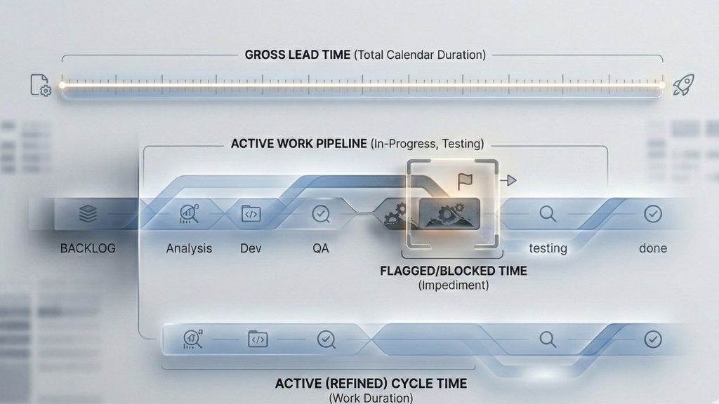
Issue Age
It represents the total time an issue has been open, from its creation until its current state or resolution. It is a simple yet powerful indicator for quickly identifying tasks that may have been overlooked or are becoming stagnant.
Resolution Time
This measures the total duration from an issue’s creation to its resolution. It provides a direct measure of a team’s responsiveness and overall delivery speed, helping to highlight issues that are taking longer than anticipated to be completed.
Cycle Time
This metric focuses on the duration an issue spends in an active, “in-progress” state, from the moment a team member begins work on it until it is completed. It is a vital indicator for measuring the efficiency of an internal process and is critical for identifying specific delays within a workflow.
Lead Time
Lead Time is a comprehensive, end-to-end metric that tracks the total time from an issue’s creation until its final resolution. It provides an overall measure of delivery speed from a customer or stakeholder perspective, encompassing all stages of the workflow.
Understanding these metrics is vital. A time in status dashboard doesn’t just show you that a project is behind schedule; it reveals where and why work is slowing down. By transforming raw data into clear visuals, these dashboards bridge the gap between abstract project status and concrete, actionable insights. This direct link from a business problem to its root cause is what makes time in status reporting an essential practice for any team looking to optimize their workflow.
Jira’s Native Reporting: Why It Falls Short?
Jira is an incredible tool, but when it comes to in-depth Time in Status reporting, its native features sometimes fall short. For instance, its “Average Time In Status” gadget tracks the average time an issue spends in a selected status, but it only does so for issues that have been resolved within the last 30 days.
A common pain point is the Days in Column view on a Kanban board. This feature is visually simple, but it calculates time on a continuous 24/7 basis, not by your team’s actual work hours. This means an issue that sits over a weekend appears to have a much longer resolution time than it actually did, creating misleading data. And that can lead to poor decisions.
For teams that attempt to work around this without a dedicated app, the process is complex and prone to error. It often involves creating multiple custom fields for each status and setting up automation rules to capture timestamps. This manual approach is difficult to maintain. Furthermore, native reports lack the granularity to group data by things like sprint or assignee and often create confusing, cluttered charts with duplicate status names.
Simply put, for professional, in-depth analysis, native Jira reporting just doesn’t get the job done for most of the teams.
A Solution for Advanced Reporting
The inherent shortcomings of native Jira reporting create a clear and compelling need for purpose-built marketplace applications. These solutions are specifically designed to overcome the challenges of inaccurate time calculations and limited reporting capabilities. They offer a streamlined way to get the detailed, accurate data that teams need for effective workflow optimization.
Among the leading solutions in the Atlassian Marketplace is Timepiece – Time in Status for Jira. Developed by OBSS, a reputable Platinum Solution Partner, the app is specifically built to provide comprehensive Time in Status reports. Its core value proposition is the ability to accurately calculate time based on real working calendars, a feature that addresses one of the most significant limitations of native Jira.
How to Avoid Jira’s 24/7 Time Calculation?
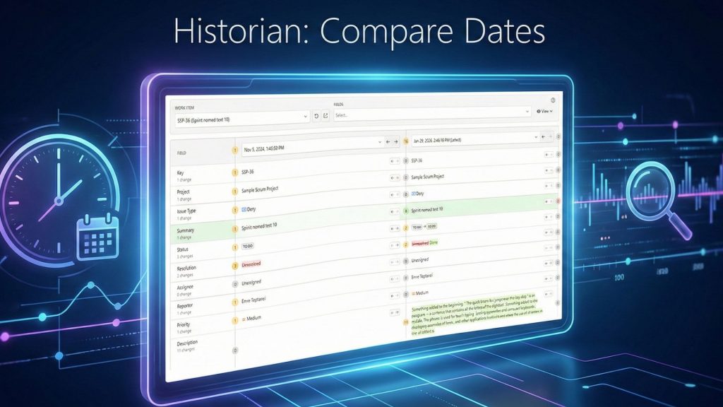
Timepiece provides a suite of advanced features, including various report types like Status Duration and Duration Between Statuses, which can be filtered using JQL and configured with consolidated columns to track metrics like Cycle Time and Lead Time. The app’s ability to use custom calendars to exclude non-working hours and days is crucial for ensuring that time calculations align with actual business operations, providing a much more precise representation of team’s efficiency. Besides, Timepiece works with your team’s existing Jira history, so there’s no need to create new custom fields or manually update anything upon installation. You can create any report just after installation as it uses your Jira history.
Step-by-Step: Building Your Time in the Status Dashboard with Timepiece
Building a powerful Time in Status dashboard with Timepiece is a straightforward process that transforms your data into actionable insights.
Step 1: Get Your Tools and a Workspace Ready
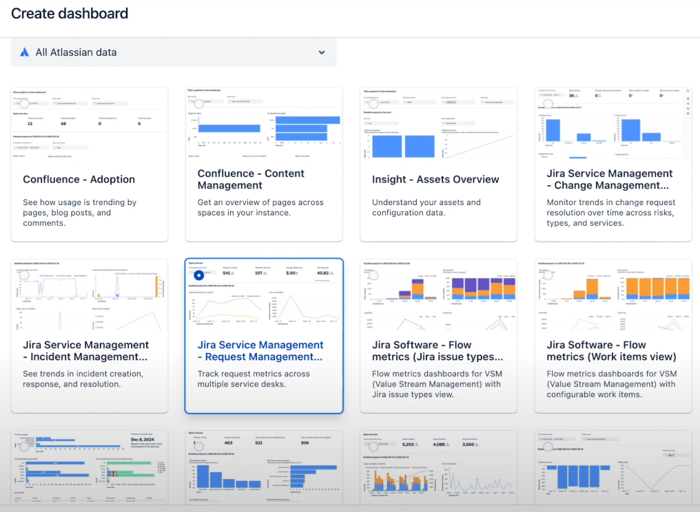
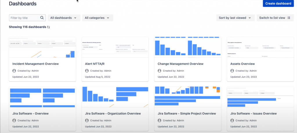
First, ensure the Timepiece – Time in Status for Jira app is installed on your Jira instance. Once the app is ready, navigate to the dashboards section by selecting Dashboards from your Jira navigation bar. From there, select Create dashboard and provide a descriptive name and a clear description so your team understands its purpose.
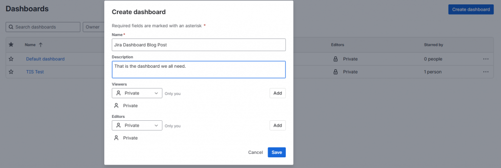
Be sure to set the appropriate permissions to share the dashboard with the relevant users or groups.
Step 2: Add the Timepiece Gadget
On your newly created dashboard, look for the “Add gadget” button and click it. A pop-up window will appear with a list of available gadgets. Use the search bar in the pop-up to find the “Timepiece” gadget and select it from the list.
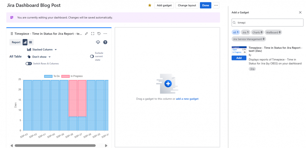
Click “Add” to place the gadget on your dashboard.
Step 3: Configure Your Report
Once the gadget is added, a configuration screen will appear, allowing you to build your report.
Choose the Report Type: The first option is to select a report type. The most common types are Status Duration to view the total time spent in each status or Duration Between Statuses to measure time between two specific workflow points, like from “In Progress” to “Done”. With more than 15 different report types available, you can easily track the metrics that matter most to you. Here are some report types you can get with Timepiece:
- Time in Status
- Assignee Time
- Group Time
- Time Between Statuses
- Status Count
- Date Reports
- Transition Count
- Time Period Report
Filter Issues with JQL: You can use the JQL field to define the scope of your report. This powerful tool allows you to filter issues by project, assignee, issue type, or any other field. For example, a query like project = “Project_Name” AND status not in (Done, Closed) will show only open issues from a specific project.
Define Columns and Metrics: Next, select the columns you want to display in your report, such as Issue Key, Assignee, or Status. A crucial feature here is Consolidated Columns, which allows you to combine multiple statuses into a single metric. For example, you can group “In Progress” and “In Review” statuses together to calculate a true Cycle Time.
Apply a Working Calendar: This is the step that ensures the accuracy of your report. Access the app’s settings to define your team’s working calendar, specifying workdays, working hours, and holidays. Once configured, select this calendar in the gadget’s settings to ensure all time calculations are based on actual business hours.
Select Chart Type: Choose a visualization that best represents your data. Timepiece supports various chart types, including bar and pie charts, as well as a Pivot Table view for deeper analysis. For comparing durations, a bar chart is often the most effective choice. So, you can choose your chart type or simply go with the list view.
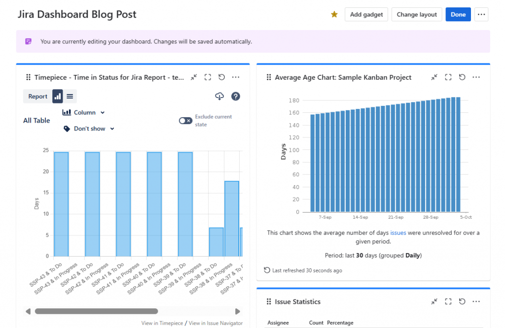
Step 4: Save and Share
After configuring your report, click “Save” to add the finished gadget to your dashboard. The Rename or share option in the dashboard menu allows for easy management of permissions.
Maximizing Your Dashboard’s Impact
Simply building a dashboard is not enough; its true value is unlocked by following a few best practices for effective design.
Avoid Clutter: A cluttered dashboard can make it difficult to quickly understand the data story being told. It is more effective to create multiple smaller, focused dashboards for specific use cases rather than one giant, all-encompassing one.
Choose the Right Chart for Your Data: The best dashboards are visual and intuitive. A list of issues, while containing data, requires the viewer to interpret the information themselves. For a truly effective report, select a chart type that visually represents the data in a clear, compelling way. For example, a bar chart is better for comparing different values than a pie chart.
Focus on a Single, Clear Narrative: A well-designed dashboard tells a single, cohesive story. All the gadgets should work together to provide a comprehensive view of a specific area, such as workflow health or sprint progress. Combining disparate reports can confuse the audience and make the entire dashboard irrelevant.
Visualize Team Bottlenecks, Improve Efficiency
By leveraging a purpose-built marketplace application like Timepiece, project teams can overcome these challenges and gain a 360-degree view of their workflows. Timepiece’s ability to calculate time based on working calendars, create custom metrics like Cycle Time and Lead Time, and provide robust visualization tools empowers teams to get a level of accuracy and detail that is essential for identifying bottlenecks and improving efficiency. The result is a highly accurate, data-driven approach to delivering projects faster and with greater confidence. To book a demo meeting or see Timepiece in action, click here.