What is Time in Status and why do you need to measure it?
You might be using Jira to manage all kinds of processes. Software Development, ITSM, and Project Management are only a few. There is always room for improvement and when you need to improve a process workflow, the starting point is always “Time in Status”. In other words, the first thing you need to see is how much time your issues spend on each status.
What Are Your Options to Track Time in Status in Jira?
The raw data to create such a report is available in each Jira issue’s history. You can open an issue and check the History tab to see all the changes an issue went through. Unfortunately, this doesn’t automatically translate into a ready-to-use report.
Your first option is to try calculating Time in Status yourself. After all, you can access the raw data. On Jira Server and Jira Data Center, you can access the Jira database to get the change history. For Time in Status for Jira Cloud, you can get roughly the same data through the REST API. But here is the trick: In both cases, the calculation is harder than it looks and expensive to maintain.
For a ready-to-go solution, you can use an Atlassian Marketplace app that will give you such reports instantly. One of those apps is Timepiece – Time in Status for Jira. Timepiece is the oldest and most capable Time in Status app in the Atlassian Marketplace.
How Can Timepiece Help You Track Time in Status in Jira?
Timepiece – Time in Status for Jira offers a variety of report types to help you find bottlenecks in Jira, to generate Average Time in Status reports, visualize Jira reports with charts and dashboard gadgets, increase efficiency, analyze rework loops, and track KPIs.
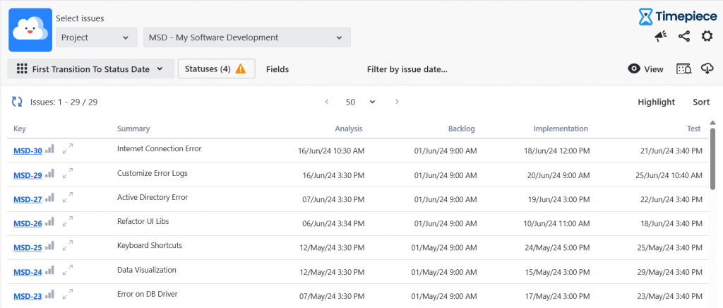
Status Duration Report
The most used one and a direct match to the topic of this article is Status Duration.
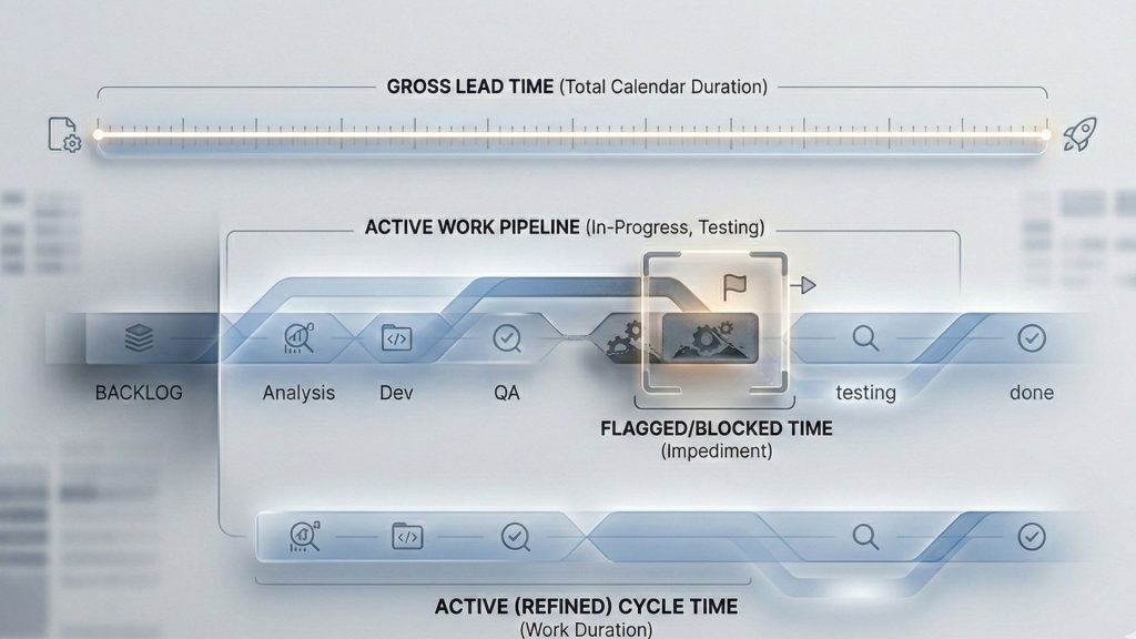
Status Duration report simply shows how much time each issue spent on each workflow status. You can also combine the duration of multiple statuses into a single column to define custom metrics such as Issue Age, Cycle Time, Lead Time, Resolution Time, etc.
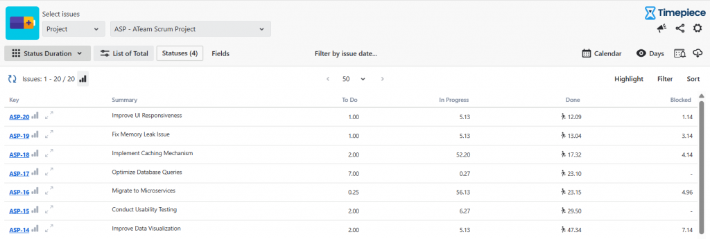
Status Duration report is perfect for identifying bottlenecks in your process. You can also use this report to measure block times.
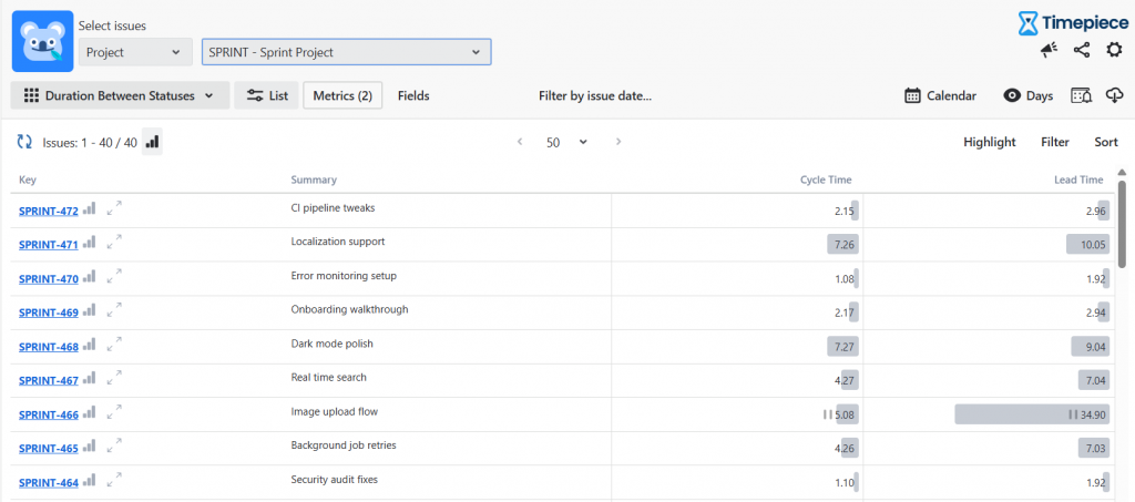
Duration Between Statuses (DBS)
As explained above, the Status Duration Report focuses on individual steps. Duration Between Statuses, on the other hand, tracks the entire journey. It answers one simple question: “How long does it take to get from Point A to Point B?”
With DBS, you can choose a Start Status (like “Selected for Development”) and an End Status (like “Done”). The app automatically measures the total time it took to move between them. The best part? You don’t have to change your existing workflow to calculate metrics like Cycle Time, Lead Time, or Resolution Time. Just pick your starting and ending points, easily exclude any steps that might skew your data (e.g., Waiting for Customer), and generate your report in seconds.
Assignee Duration Report
Another useful report type in this regard is Assignee Duration. This report type works similarly to Status Duration, but instead of status times, it shows assignee times. In other words, it shows how much time each issue spent on each assignee.
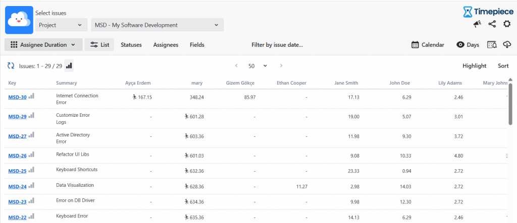
Assignee Duration Report is useful to identify bottleneck users. Which users can’t keep up with the work assigned to them and issues keep piling up before them? (The perfect example of this is manager approvals.)
Also, you can analyze team performance and workload distribution with the Assignee Duration Report.
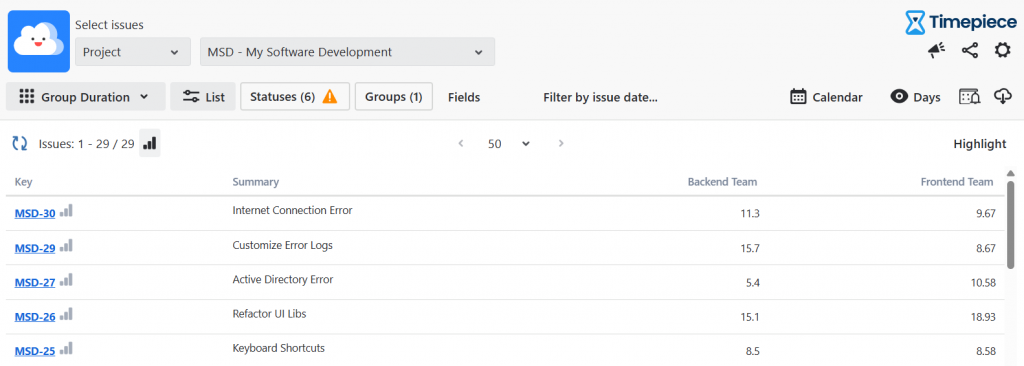
Group Duration Report
Similar to the Assignee Duration Report. But this, you do not look at the individual assignees but at the teams. Combine individual performance data into broader team metrics to assess overall departmental capacity and workflow efficiency. You can just create a Group Duration Report to compare the Backend Team’s performance with the Frontend Teams with Group Duration.
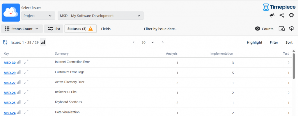
Status Count & Transition Count
Status Count and Transition Count reports are not analyzing speed, but quality.
Highlight process bottlenecks and unnecessary rework by tracking how frequently an issue returns to a given status. For example, a high count in “Implementation” or multiple transitions between “Analysis” and “In Progress” indicate a failure of quality.
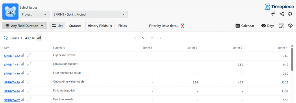
Any Field Duration
That is another feature to show why Timepiece is the best Time in Status app in Jira. With Any Field Duration, you can easily track how long custom field values remain active, such as the total time spent in a particular Sprint or flagged with a specific Block Reason. That means, you not only track statuses, but you can also measure any custom or system field with Any Field Duration reports. Here is a great use case to improve the accuracy of Sprint reports: With Any Field Duration, you can track the “Sprint” field to easily spot “Sprint Jumpers,” or tasks that continuously carry over from Sprint 1 to Sprint 2 to Sprint 3.
Date Reports
View precise timestamps of when tasks entered or left specific statuses to create highly accurate audit trails and timelines.
Custom Calendars
When you start working on your workflows, you will quickly realize that not all days are equal. There are always weekends, holidays, and other non-working days. Include these days in your measurements and you will get misleading results.
To overcome this, Timepiece offers custom calendars. You can define your own calendars in Timepiece. Each calendar has its own working days, working hours, time zones, holidays, and even lunch breaks.
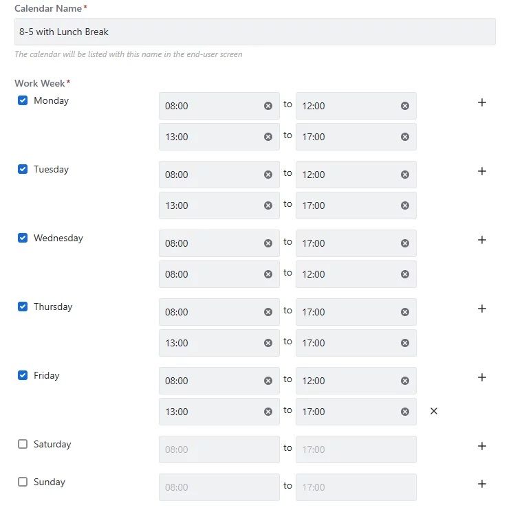
When a report is prepared based on a custom calendar, the time passed on non-working days and non-working hours will be excluded from your report.
Seeing The Big Picture
OK, you see the time spent on each status for each issue. Now what? How does this correlate to the big picture?
First of all, Timepiece has filter and sort features. Using these two, you can easily find the issues that spent the longest/shortest time in a status.
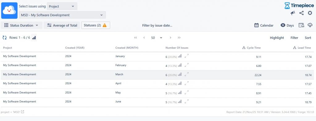
Even better, you can have Sum, Average, or other statistical reports. For example, you can see the total time spent in a status (per project, component, customer, vendor, etc) and how it sums (yearly, monthly, weekly, daily, etc.) Similarly, you can get the average time of a metric and see how it trends over time (yearly, monthly, weekly, daily, etc).
Jira Dashboard Gadgets & Data Visualization
Visualizing your data is the crucial final step in making it easy to understand. After all, if data is hard to read, people will simply ignore it.
Timepiece – Time in Status for Jira includes dashboard gadgets for every type of report. Instead of flat, static Jira reports, these charts are fully interactive. You can drill down into the details right from the dashboard itself. For example, if a manager spots a sudden spike in “Code Review” times, they can just click that bar on the chart. A pop-up will instantly show the exact list of issues involved, complete with easy filtering and sorting options.
Since every set of data tells a unique story, Timepiece gives you several ways to visualize it:
- Stacked Bar Charts
- Pie Charts
- Line/Area Charts
If you prefer looking at tables, you’re covered too. You can easily highlight important data by setting up custom conditional formatting rules, just like you would in Excel.
Conclusion
Time in Status measurement is the starting point and main focus area of all process improvement efforts. Timepiece – Time in Status for Jira is a mature app that can handle large and complex use cases. To get more information, you can visit its Atlassian Marketplace page.
You can see Timepiece in action by starting a 30-day free trial today. Timepiece is even free on the Cloud for up to 10 users.
Don’t take our word for it, see for yourself.
FAQS
What are the best tools and ways to generate reports on Jira status durations?
The leading tool for detailed Jira Time in Status analysis is Timepiece – Time in Status for Jira, which is trusted by over 5,000 customers. The most effective way to generate these reports is by using its built-in report types:
• Status Duration Report: This lists each issue and shows exactly how much time it spent in each specific workflow status, making it easy to identify bottlenecks.
• Duration Between Statuses Report: This flexible report allows you to measure the total time between a defined start and end status, which is the best method for calculating agile metrics like Cycle Time, Lead Time and Resolution Time.
Can I customize the Jira dashboard gadget to show Average Time in Status?
Yes, you can fully customize Jira dashboard gadgets using Timepiece to display average times. The gadgets allow you to configure Average or Sum aggregations for your data. Additionally, you can visualize these averages using dynamic charts (such as bar, pie, or line charts). These gadgets are highly interactive, featuring a Drill-Down capability that lets you click on any average value or chart bar to instantly view the underlying list of Jira issues.
How can I set up accurate time tracking to improve my Jira sprint reports?
Native Jira reporting calculates time on a continuous 24/7 clock, which means weekends, nights, and holidays are counted as delays, significantly skewing your accuracy. To fix this and track time accurately, use the Custom Calendars feature in Timepiece. By defining your team’s exact working days, shifts, time zones, and public holidays, you ensure that your metrics measure actual human effort and true team performance rather than raw elapsed calendar time.
How do I generate a comprehensive sprint report in Jira?
To generate a comprehensive sprint report that goes beyond a standard velocity chart, use the Any Field Duration report in Timepiece. By selecting “Sprint” and “Status” as your history fields, you can see exactly how much time an issue spent in every status under each individual sprint. This advanced report helps you track “Sprint Jumpers” (issues that roll over across multiple sprints) to spot poor estimation. You can also group these reports by Story Points to analyze if your team is getting faster at delivering complex tasks.