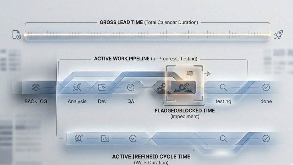
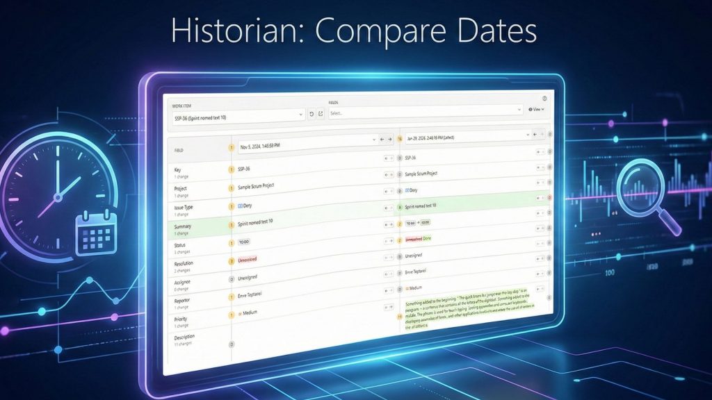
The cloud version of Time in Status by OBSS now provides charts. As a first step of our chart investment, we are introducing charts to Time in Status tab that is available on Issue View Tab.
Issue View tab used to display Time in Status report data in a tabular fashion. With the introduction of charts, this tab now contains two sub tabs. The first one still shows the data and the second one shows charts.


The are many chart types available and different report types support different chart options.


While developing this we quickly realized that when looking at an issue that was not updated for a long time, for example for an issue that was closed months ago and was not updated since, charts display pretty much useless information because the chart is dominated by the latest state of the issue.
For example, the column chart below shows status durations of an issue that was closed more than 1100 days ago. All statuses do contain values but their values are so small compared to Closed that they are not visible.

To overcome this, we added the Exclude Current State option. When checked, this option excludes the durations from the report since the last update.
The same chart displays much more useful information when the current state is excluded:

Please note that Exclude Current State does not exclude the latest status completely but rather excludes the duration since the latest status/assignee change in issue history. If the issue has visited Closed status more than once, the Closed column will still display a value grater than zero when Exclude Current State is checked.
As always, feel free to reach us through plugin@obss.com.tr or pluginsupport.obss.com.tr if you have any questions.


