Progress feels slow, even when velocity is high?
That’s a common problem. Velocity reports don’t show hidden bottlenecks. To see the real issues, you need to analyze your Cycle Time and Lead Time trends. This guide shows how to do that in Timepiece.
Why Trend Analysis is a Must?
Before we build a report, why do this? A trend report helps you:
Find bottlenecks: See exactly which steps are slowing things down.
Spot anomalies: Instantly see a sudden spike in wait times and find out why.
Understand delays: See why specific tasks are taking longer than expected.
Check workflow performance: Track how the team’s efficiency is changing over time.
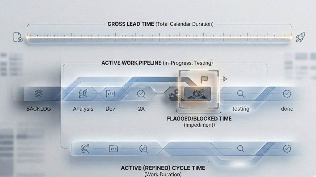
What Are Cycle Time and Lead Time?
You need to know what you’re measuring. They are not the same thing.
Lead Time: This is the customer’s view. It’s the total time from when an issue is created to when it is resolved. It includes all waiting, even time in the backlog.
Cycle Time: This is the team’s view. It’s the time from when the team starts working (e.g., ‘In Progress’) to when the work is finished (e.g., ‘Done’). It’s a part of Lead Time.
To learn more about Cycle Time and Lead Time, feel free to check out this blog post.
How to Measure: Two Ways to Get the Data
Timepiece gives you two main reports to get this data. Which one you use depends on your needs.
Method 1: Status Duration Report
Use this when your “Cycle Time” is a specific group of statuses (like ‘Analysis’ + ‘In Progress’ + ‘Test’) and you want to add them up.
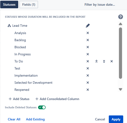
You do this using Consolidated Columns, which lets you group multiple statuses into one column.
- Open the Status Duration report.
- Click the Statuses button.
- Click Add Consolidated Column.
- Name it “Cycle Time” and select your “active” statuses into it.

You can make another one for “Lead Time” by selecting all your statuses into it.
Method 2: Duration Between Statuses Report
Use this when you only care about the time between a start and an endpoint. You don’t care what happens in between. This is great for an SLA-like metric.
Open the Duration Between Statuses report.
Click the Metrics button.
Create new metrics and name them as ”Cycle Time” and ‘’Lead Time’’
For Cycle Time, set the From Status to your starting point (e.g., In Progress) and To Status to your endpoint (e.g., Done).
For Lead Time, set the From Status to your backlog (e.g., To Do) and To Status to your end point (e.g., Done)

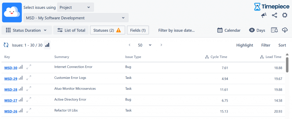
Once you click ‘’Apply’’, you’ll get a report showing numbers. For example, issue MSD-29 has a Cycle Time of 4.94 days and a Lead Time of 19.88 days.
How to Turn Your Data into a Trend
Okay, we got the raw list of numbers. It is good. Here is how our example’s Lead Time and Cycle Time look like before turning data into a trend analysis. But, these numbers are not showing any trend. You must group the data. With Timepiece, you do this in two simple steps.
Step 1: Choose Your Metric (Average vs. Sum)
Step 2: Group the Data (The “Group By”)
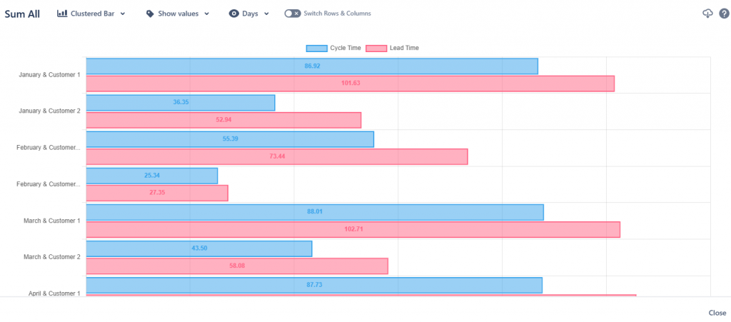
This is the most important step. Use the Group By options to create your trend.
To see a trend over time: Group by a date field, like Created (WEEK) or Created (MONTH). This is how you spot if you are getting faster or slower.
Let’s begin then. First, tell Timepiece how to add up the numbers. In the report’s top-left menu, change the report options.
Average of Total: Use this to see the average time. This is best for a typical Cycle Time trend. It answers, “On average, how long did tasks take in the last weeks?”

Sum of Total: Use this to see the total effort. This is especially useful for service desks. It answers, “In total, how many hours did we spend on Customer A this month?

To increase visualization, you can also see data on a bar, column or line chart.
How to Read the Report And Find the “Why?”
So you’ve built the report. What do you do with it? Imagine your report shows a healthy, stable Cycle Time of around 8-10 days for most weeks. That’s good.
But what if one week, the average jumps to 20 days? This is where the report’s context is key. The Number Of Issues column might show “1” or “2.” This tells you the problem isn’t the whole team; it’s a single outlier issue that got stuck.
What to Do Next: Drill Down. The report doesn’t just show you the “what”; it helps you find the “why.”
Just click on that “65.67” in the table.
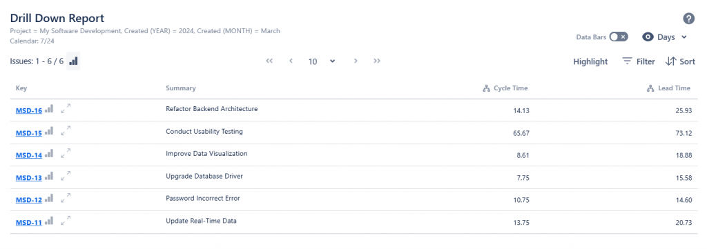
Timepiece’s drill-down feature will show you the exact list of issues used for that calculation. You can open the one or two problem issues and see exactly where they spent all that time. Now you have a specific, real problem to solve instead of guessing.
Here’s another way to use this. Let’s say you just put a new policy in place, hired a new teammate, or restructured your team. You want to see what happened after that decision. A trend analysis lets you compare the “before” and “after” periods, so you can easily see the effects—positive or negative—with real data. To learn more about Timepiece – Time in Status for Jira, visit its Atlassian Marketplace page. You can see the documentation page by clicking here, and book a demo meeting by clicking here.